Wednesday, October 31, 2018

Why Social Media and Word of Mouth Are Not the Same Thing

why social media word of mouth not the same thing

Social media itself isn't word of mouth — it's one way that word of mouth spreads. #wordofmouth
Click To Tweet

In our social media-dominated world, most people have the impression that word of mouth has transitioned from in-person conversations to retweets and direct messages. They believe that social media IS word of mouth. Not true.

Social media garners plenty of attention and marketing budgets. But offline chatter is an equal, and sometimes more impactful, driver of awareness and preference.

It’s not that social media and online word of mouth don’t matter; they do. In fact, half of all word of mouth takes place online. However, research shows that offline word of mouth is more persuasive. According to a study by the Keller Fay Group, 50 percent of consumers say they are very likely to make a purchasing decision based on a real-life conversation. Meanwhile, 43 percent of consumers feel the same way after an online discussion.

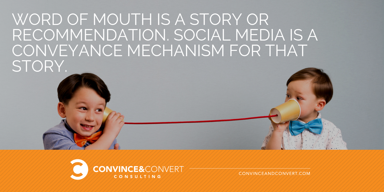
It’s also important to understand that social media itself isn’t word of mouth; it’s one way that word of mouth spreads. Word of mouth is a story or recommendation. Social media is a conveyance mechanism for that story. So is a review. So is a phone call. So is a conversation.

Thus, having a popular Instagram account is not the same as using thoughtful word of mouth. Likes and comments are quite different and less effective than word-of-mouth recommendations.

word of mouth vs social

The Math on Why Word of Mouth Matters

A single recommendation from an influencer spreads at an annual rate of eight factorial, according to Ted Wright, author of Fizz. Setting aside any complex math, a single recommendation passed from person to person over the course of a year ultimately reaches a total of 40,370 people. In other words, that recommendation from one person impacts 40,369 other potential customers.

We have LOTS more research on word of mouth in our new study, Chatter Matters: The 2018 Word of Mouth Report

What business wouldn’t want to cultivate these conversations and quickly multiply the number of people passing along positive recommendations? In spite of this potential, relatively few companies — think less than 1 percent — have an actual plan for word-of-mouth marketing.

Instead, most businesses are putting all their eggs in the social media basket. Social media budgets in the U.S. are projected to jump from $4.3 billion in 2012 to more than $23 billion in 2019. Even with this eye-popping spending spree, social media remains less effective than traditional person-to-person exchanges when it comes to word of mouth.

Offline conversations are incredibly powerful, though these discussions are difficult to track for your average marketing team. It’s hard to know if and when these comments happen. Jonah Berger, the author of Contagious, explains word of mouth perfectly:

You can shape it, you can encourage it, you can drive it, but you can’t buy it.

This might make it seem like generating word of mouth is impossible, but there’s a secret weapon for creating these organic conversations: talk triggers.

Give Them Something to Talk About

Establishing impactful word of mouth begins with giving people something they cannot help but talk about. It could be as simple as a cookie on a hotel pillow, funny hold music, or an unusually extensive menu.

Establishing impactful word of mouth begins with giving people something they cannot help but talk about. #TalkTriggers
Click To Tweet

These talk triggers are noteworthy experiences that your customers will rush to share with their friends and family members. Those people will then share that same story (or at least a close approximation of it) with their friends.

The good news? Your talk trigger can be just about anything. The only real criterion is that it must be uncommon or remarkable enough to get noticed.

Confused about what is and what isn’t a talk trigger? We talk about the four requirements for a talk trigger in my new book, written with Daniel Lemin:

A talk trigger must be:

  1. Remarkable
  2. Relevant
  3. Reasonable
  4. Repeatable

One talk trigger with incredible longevity comes to us courtesy of the banking world. In this seemingly unremarkable industry where every bank offers pretty much the same services as the next one, brands must truly do something noteworthy to get people talking.

Umpqua Bank, headquartered in Portland, Oregon, is one of the 50 largest banking chains in the U.S. Each of Umpqua’s more than 300 locations prominently displays a silver telephone in its lobby. Since 1994, any customer can pick up one of these phones to be instantly connected with the company’s CEO. Not the manager of the branch or even the region — a direct line to the leader of the company.

It’s easy to imagine how this feature triggers conversations that positively affect the brand. Whenever a customer picks up the silver phone (whether he or she has something to say or is simply checking to see whether the phone actually works), president and CEO Cort O’Haver answers to create truly talk-worthy experiences.

Moving Beyond Social Media Buzz

Getting people talking and earning word-of-mouth recommendations involves more than chance — it requires a strategic plan. Andy Sernovitz, co-founder of the Word of Mouth Marketing Association, encourages marketers to see social and offline as valuable but different tools. Social is useful in that it is instantly shareable, but offline truly shines for its credible repeatability.

There’s nothing wrong with pairing the yin with the yang — offline and social in this case — but truly effective word-of-mouth marketing requires a lot more than a few buzzworthy tweets. Instead of throwing the bulk of your marketing dollars into the social media abyss, invest some of your valuable resources into creating truly noteworthy experiences. Your customers will be enamored, and their real-life networks will be more than happy to spread the word.

For more information on Talk Triggers, visit the official site, packed with free resources.

And, our team at Convince & Convert helps interesting brands create their own word of mouth strategy.

The post Why Social Media and Word of Mouth Are Not the Same Thing appeared first on Convince and Convert: Social Media Consulting and Content Marketing Consulting.

https://ift.tt/2ETXWY8

8 Easy Ways for Beginners to Edit and Improve Videos for Social Media

8 Easy Ways for Beginners to Edit and Improve Videos for Social Media

Creating and publishing videos for social media is a great way to reach a much wider audience, and you will be able to engage them in social media more effectively with video as well. However if you want to come up with the kind of videos that are able to really attract lots of viewers – you need to learn how to edit and improve them.

For beginners that is often a pretty big hurdle, and video editing is known to have a steep learning curve. Trying to familiarize yourself with an editor is difficult enough, and initially you are going to probably feel lost and not know where to start.

The best way to learn how to edit videos more effectively however is to jump right in and start doing it. In particular it helps if you’re aware of some of the easy ways that you can edit videos for social media – so you can use them as a place to start.

https://ift.tt/2qkybWV

How to Combine Facebook Ads and Email Marketing for Better Conversions

Do you want an effective way to get more leads? Wondering how to nurture leads into becoming customers? In this article, you’ll discover how to use Facebook ads with email marketing to improve your conversions. Why Your Business Needs Both Facebook Ads and Email Marketing For as long as I can remember, marketers have hailed

The post How to Combine Facebook Ads and Email Marketing for Better Conversions appeared first on Social Media Examiner.

https://ift.tt/2Q55rwt

Tuesday, October 30, 2018

3 Statistics on How Millennials Are Choosing Restaurants

millennials restaurant statistic

If you’re under the age of 35 and have eaten in a restaurant lately, chances are you asked a specific group for help to make your choice.

Choosing where to eat isn’t easy for anyone, regardless of generation or geography. And, perhaps unsurprisingly, half of all Americans look to recommendations from friends and family when making the big decision. Perhaps that’s in part to who we eat with, and how we eat: those closest to us know us best. But the impact of offline word of mouth and chatter from a consumer’s own social media environment vary.

Statistic #1: When choosing a restaurant, Gen Z and Millennials are 99% more likely to rely on social media and online reviews than are Gen X and Boomers.

When choosing a restaurant, Gen Z and Millennials are 99% more likely to rely on social media and online reviews than are Gen X and Boomers. #ChatterMatters
Click To Tweet

As we discovered in Chatter Matters, our 2018 report on word of mouth, younger generations are more 99% more likely to lean on their friends and family than older generations when choosing a restaurant. Equally surprising among younger consumers is the impact of advertising on their decision-making: 33% of Gen Z say ads cause them to usually (or always) try new things, compared with 21% of Americans overall.

Statistic #2: 33% of Generation Z say ads cause them to usually (or always) try new things, compared with 21% of Americans overall.

33% of Generation Z say ads cause them to usually (or always) try new things, compared with 21% of Americans overall. #ChatterMatters
Click To Tweet

Is it that younger consumers are more driven by trends, or approach their dining decisions with more enthusiasm than older generations?

It might have something to do with the dining BEHAVIOR of younger generations. In a recent study from Piper Jaffray, Chick-fil-A is the favorite restaurant for teens, topping even Starbucks. And, in that same study, they also found that food is the No. 1 driver of spending for teen consumers.

Statistic #3: Chick-fil-A is the favorite restaurant for teens, topping even Starbucks.

Starbucks is particularly good at creating short-term demand for products. Remember their Unicorn Frappucino? If unicorns aren’t your thing, how about the Zombie Frappucino?

There were reports during the Unicorn Frappucino hullabaloo of Starbucks baristas going home with unicorn dust in their hair and near permanent grimaces on their face.

It might be that the lower average purchase price for most younger consumers during their dining experience influences how they wind up eating and choosing where they eat. It’s not a $65 per person splurge; it’s a chicken sandwich or a drink that doubles as a sugar bomb.

Interested in learning more about the impact word-of-mouth marketing has on America’s collective buying decisions? Check out our full report for free.

The post 3 Statistics on How Millennials Are Choosing Restaurants appeared first on Convince and Convert: Social Media Consulting and Content Marketing Consulting.

https://ift.tt/2DbUGFP

How to Repurpose Your eCommerce Content as Social Video

How to Repurpose Your eCommerce Content as Social Video

Posting video to your social media profiles can be an excellent way to generate traction for your marketing. One poll found that 51% of marketers cite video marketing as the best way to boost ROI. Despite the obvious benefits of video marketing for social media, most marketers shy away from it.

Video marketing might seem like it takes a lot of work and money. However, there are ways to make it more efficient and light on resources.

Start by choosing the right social networks for syndicating your video content. Then, simply repurpose your existing content as video, making sure that the assets you select are compatible with the tastes of the demographic that you are targeting.

Understanding the nuances of these video marketing elements is necessary to optimize your campaign and get the best ROI for the least amount of work. Let’s take a look at some of the details, starting with the tactics that work best on different social networks.

https://ift.tt/2SvODjS

7 Ways to Create Better Instagram Engagement for Businesses

Are you looking for ways to get more Instagram engagement? Wondering how to build stronger consumer relationships? In this article, you’ll discover seven ways to improve your Instagram engagement. #1: Follow Through on Follower Engagement to Stay in Step With Your Community While it’s the first rule of social media marketing, lots of brands and

The post 7 Ways to Create Better Instagram Engagement for Businesses appeared first on Social Media Examiner.

https://ift.tt/2zcThdG

Monday, October 29, 2018

How to Use Facebook Dynamic Ads for Time-Sensitive Sales

Do you want to promote time-sensitive sales using Facebook ads? Wondering how to set up Facebook dynamic ads for Black Friday, Cyber Monday, or other seasonal sales? In this article, you’ll discover how to set up your product feed to run Facebook dynamic ads with beginning and end dates. #1: Design Product Images That Reflect

The post How to Use Facebook Dynamic Ads for Time-Sensitive Sales appeared first on Social Media Examiner.

https://ift.tt/2D94h01

How to Drive Organic Traffic With Bots

Want more website visitors? Wondering how Messenger bots can help? To explore how to bots can drive organic traffic to your website, I interview Natasha Takahashi. More About This Show The Social Media Marketing podcast is designed to help busy marketers, business owners, and creators discover what works with social media marketing. In this episode,

The post How to Drive Organic Traffic With Bots appeared first on Social Media Examiner.

https://ift.tt/2JnxIfk

How to Create Highly Shareable Images for Your Content Marketing

How to Create Highly Shareable Images for Your Content Marketing

After you create your content you should spend an ample amount of time promoting it. When getting started with content marketing most people dedicate more time to creating and less time to promoting. But experienced marketers know the importance of content promotion. Some top marketers like Derek Halpern spend as much as 80% of their time promoting and only 20% creating.

Promoting your content will make all the time spent creating it worthwhile. It will also help your content get more traffic and generate more leads and sales.

One way to promote your content is by creating highly shareable images to accompany it. Images drive the highest engagement on networks like Facebook, Twitter, and Pinterest and can drive a lot of traffic to your site.

So, today I’m going to show you exactly what types of images drive the highest traffic and how to quickly create them…

Choose the platforms:

While promoting your content on social media you should create one unique image for each social network.

https://ift.tt/2StBuIe

How to Use Facebook Dynamic Ads for Time-Sensitive Sales

Do you want to promote time-sensitive sales using Facebook ads? Wondering how to set up Facebook dynamic ads for Black Friday, Cyber Monday, or other seasonal sales? In this article, you’ll discover how to set up your product feed to run Facebook dynamic ads with beginning and end dates. #1: Design Product Images That Reflect

The post How to Use Facebook Dynamic Ads for Time-Sensitive Sales appeared first on Social Media Examiner.

https://ift.tt/2z9WR8y

Building Links with Great Content - Natural Syndication Networks

Posted by KristinTynski

The debate is over and the results are clear: the best way to improve domain authority is to generate large numbers of earned links from high-authority publishers.

Getting these links is not possible via:

  • Link exchanges
  • Buying links
  • Private Blog Networks, or PBNs
  • Comment links
  • Paid native content or sponsored posts
  • Any other method you may have encountered

There is no shortcut. The only way to earn these links is by creating content that is so interesting, relevant, and newsworthy to a publisher’s audience that the publisher will want to write about that content themselves.

Success, then, is predicated on doing three things extremely well:

  1. Developing newsworthy content (typically meaning that content is data-driven)
  2. Understanding who to pitch for the best opportunity at success and natural syndication
  3. Writing and sending pitches effectively

We’ve covered point 1 and point 3 on other Moz posts. Today, we are going to do a deep dive into point 2 and investigate methods for understanding and choosing the best possible places to pitch your content. Specifically, we will reveal the hidden news syndication networks that can mean the difference between generating less than a handful or thousands of links from your data-driven content.

Understanding News Syndication Networks

Not all news publishers are the same. Some publishers behave as hubs, or influencers, generating the stories and content that is then “picked up” and written about by other publishers covering the same or similar beats.

Some of the top hubs should be obvious to anyone: CNN, The New York Times, BBC, or Reuters, for instance. Their size, brand authority, and ability to break news make them go-to sources for the origination of news and some of the most common places journalists and writers from other publications go to for story ideas. If your content gets picked up by any of these sites, it’s almost certain that you will enjoy widespread syndication of your story to nearly everywhere that could be interested without any intervention on your part.

Unfortunately, outside of the biggest players, it’s often unclear which other sites also enjoy “Hub Status,” acting as a source for much of the news writing that happens around any specific topic or beat.

At Fractl, our experience pitching top publishers has given us a deep intuition of which domains are likely to be our best bet for the syndication potential of content we create on behalf of our clients, but we wanted to go a step further and put data to the question. Which publishers really act as the biggest hubs of content distribution?

To get a better handle on this question, we took a look at the link networks of the top 400 most trafficked American publishers online. We then utilized Gephi, a powerful network visualization tool to make sense of this massive web of links. Below is a visualization of that network.

An interactive version is available here.

Before explaining further, let’s detail how the visualization works:

  • Each colored circle is called a node. A node represents one publisher/website
  • Node size is related to Domain Authority. The larger the node, the more domain authority it has.
  • The lines between the nodes are called edges, and represent the links between each publisher.
  • The strength of the edges/links corresponds to the total number of links from one publisher to another. The more links from one publisher to another, the stronger the edge, and the more “pull” exerted between those two nodes toward each other.
  • You can think of the visualization almost like an epic game of tug of war, where nodes with similar link networks end up clustering near each other.
  • The colors of the nodes are determined by a “Modularity” algorithm that looks at the overall similarity of link networks, comparing all nodes to each other. Nodes with the same color exhibit the most similarity. The modularity algorithm implemented in Gephi looks for the nodes that are more densely connected together than to the rest of the network

Once visualized, important takeaways that can be realized include the following:

  1. The most “central” nodes, or the ones appearing near the center of the graph, are the ones that enjoy links from the widest variety of sites. Naturally, the big boys like Reuters, CNN and the NYTimes are located at the center, with large volumes of links incoming from all over.
  2. Tight clusters are publishers that link to each other very often, which creates a strong attractive force and keeps them close together. Publishers like these are often either owned by the same parent company or have built-in automatic link syndication relationships. A good example is the Gawker Network (at the 10PM position). The closeness of nodes in this network is the result of heavy interlinking and story syndication, along with the effects of site-wide links shared between them. A similar cluster appears at the 7PM position with the major NBC-owned publishers (NBC.com, MSNBC.com, Today.com, etc.). Nearby, we also see large NBC-owned regional publishers, indicating heavy story syndication also to these regional owned properties.
  3. Non-obvious similarities between the publishers can also be gleaned. For instance, notice how FoxNews.com and TMZ.com are very closely grouped, sharing very similar link profiles and also linking to each other extensively. Another interesting cluster to note is the Buzzfeed/Vice cluster. Notice their centrality lies somewhere between serious news and lifestyle, with linkages extending out into both.
  4. Sites that cover similar themes/beats are often located close to each other in the visualization. We can see top-tier lifestyle publishers clustered around the 1PM position. News publishers clustered near other news publishers with similar political leanings. Notice the closeness of Politico, Salon, The Atlantic, and The Washington Post. Similarly, notice the proximity of Breitbart, The Daily Caller, and BizPacReview. These relationships hint at hidden biases and relationships in how these publishers pick up each other’s stories.
A More Global Perspective

Last year, a fascinating project by Kalev Leetaru at Forbes looked at the dynamics Google News publishers in the US and around the world. The project leveraged GDelt’s massive news article dataset, and visualized the network with Gephi, similarly to the above network discussed in the previous paragraph.

This visualization differs in that the link network was built looking only at in-context links, whereas the visualization featured in the previous paragraph looked at all links. This is perhaps an even more accurate view of news syndication networks because it better parses out site-wide links, navigation links, and other non-context links that impact the graph. Additionally, this graph was generated using more than 121 million articles from nearly every country in the world, containing almost three-quarters of a billion individual links. It represents one of the most accurate pictures of the dynamics of the global news landscape ever assembled.

Edge weights were determined by the total number of links from each node to each other node. The more links, the stronger the edge. Node sizes were calculated using Pagerank in this case instead of Domain Authority, though they are similar metrics.

Using this visualization, Mr. Leetaru was able to infer some incredibly interesting and potentially powerful relationships that have implications for anyone who pitches mainstream publishers. Some of the most important include:

  1. In the center of the graph, we see a very large cluster. This cluster can be thought of as essentially the “Global Media Core,” as Mr. Leetaru puts it. Green nodes represent American outlets. This, as with the previous example, shows the frequency with which these primary news outlets interlink and cover each other’s stories, as well as how much less frequently they cite sources from smaller publications or local and regional outlets.
  2. Interestingly, CNN seems to play a unique role in the dissemination to local and regional news. Note the many links from CNN to the blue cluster on the far right. Mr. Leetaru speculates this could be the result of other major outlets like the NYTimes and the Washington Post using paywalls. This point is important for anyone who pitches content. Paywalls should be something taken into consideration, as they could potentially significantly reduce syndication elsewhere.
  3. The NPR cluster is another fascinating one, suggesting that there is heavy interlinking between NPR-related stories and also between NPR and the Washington Post and NYTimes. Getting a pickup on NPR’s main site could result in syndication to many of its affiliates. NYTimes or Washington Post pickups could also have a similar effect due to this interlinking.
  4. For those looking for international syndication, there are some other interesting standouts. Sites like NYYibada.com cover news in the US. They are involved with Chinese language publications, but also have versions in other languages, including English. Sites like this might not seem to be good pitch targets, but could likely be pitched successfully given their coverage of many of the same stories as US-based English language publications.
  5. The blue and pink clusters at the bottom of the graph are outlets from the Russian and Ukrainian press, respectively. You will notice that while the vast majority of their linking is self-contained, there seem to be three bridges to international press, specifically via the BBC, Reuters, and AP. This suggests getting pickups at these outlets could result in much broader international syndication, at least in Eastern Europe and Russia.
  6. Additionally, the overall lack of deep interlinking between publications of different languages suggests that it is quite difficult to get English stories picked up internationally.
  7. Sites like ZDnet.com have foreign language counterparts, and often translate their stories for their international properties. Sites like these offer unique opportunities for link syndication into mostly isolated islands of foreign publications that would be difficult to reach otherwise.

I would encourage readers to explore this interactive more. Isolating individual publications can give deep insight into what syndication potential might be possible for any story covered. Of course, many factors impact how a story spreads through these networks. As a general rule, the broader the syndication network, the more opportunities that exist.

Link Syndication in Practice

Over our 6 years in business, Fractl has executed more than 1,500 content marketing campaigns, promoted using high-touch, one-to-one outreach to major publications. Below are two views of content syndication we have seen as a result of our content production and promotion work.

Let’s first look just at a single campaign.

Recently, Fractl scored a big win for our client Signs.com with our “Branded in Memory” campaign, which was a fun and visual look at how well people remember brand logos. We had the crowd attempt to recreate well-known brand logos from memory, and completed data analysis to understand more deeply which brands seem to have the best overall recall.

As a result of strategic pitching, the high public appeal, and the overall "coolness" factor of the project, it was picked up widely by many mainstream publications, and enjoyed extensive syndication.

Here is what that syndication looked like in network graph form over time:

If you are interested in seeing and exploring the full graph, you can access the interactive by clicking on the gif above, or clicking here. As with previous examples, node size is related to domain authority.

A few important things to note:

  • The orange cluster of nodes surrounding the central node are links directly to the landing page on Signs.com.
  • Several pickups resulted in nodes (publications) that themselves generated many numbers of links pointing at the story they wrote about the Signs.com project. The blue cluster at the 8PM position is a great example. In this case it was a pickup from BoredPanda.com.
  • Nodes that do not link to Signs.com are secondary syndications. They pass link value through the node that links to Signs.com, and represent an opportunity for link reclamation. Fractl follows up on all of these opportunities in an attempt to turn these secondary syndications into do-follow links pointing directly at our client’s domain.
  • An animated view gives an interesting insight into the pace of link accumulation both to the primary story on Signs.com, but also to the nodes that garnered their own secondary syndications. The GIF represents a full year of pickups. As we found in my previous Moz post examining link acquisition over time, roughly 50% of the links were acquired in the first month, and the other 50% over the next 11 months.

Now, let’s take a look at what syndication networks look like when aggregated across roughly 3 months worth of Fractl client campaigns (not fully comprehensive):

If you are interested in exploring this in more depth, click here or the above image for the interactive. As with previous examples, node size is related to domain authority.

A few important things to note:

  1. The brown cluster near the center labeled “placements” are links pointing back directly to the landing pages on our clients’ sites. Many/most of these links were the result of pitches to writers and editors at those publications, and not as a result of natural syndication.
  2. We can see many major hubs with their own attached orbits of linking nodes. At 9PM, we see entrepreneur.com, at 12PM we see CNBC.com, 10PM we see USAToday, etc.
  3. Publications with large numbers of linking nodes surrounding them are examples of prime pitching targets, given how syndications link back to stories on those publications appear in this aggregate view.
Putting it All Together

New data tools are enabling the ability to more deeply understand how the universe of news publications and the larger "blogosphere" operate dynamically. Network visualization tools in particular can be put to use to yield otherwise impossible insights about the relationships between publications and how content is distributed and syndicated through these networks.

The best part is that creating visualizations with your own data is very straightforward. For instance, the link graphs of Fractl content examples, along with the first overarching view of news networks, was built using backlink exports from SEMrush. Additionally, third party resources such as Gdelt offer tools and datasets that are virtually unexplored, providing opportunity for deep understanding that can convey significant advantages for those looking to optimize their content promotion and syndication process.


Sign up for The Moz Top 10, a semimonthly mailer updating you on the top ten hottest pieces of SEO news, tips, and rad links uncovered by the Moz team. Think of it as your exclusive digest of stuff you don't have time to hunt down but want to read!

https://ift.tt/2OcclOw

Sunday, October 28, 2018

9 Brands Crushing It with Instagram Stories

brands using instagram stories

Do you know what I like more than just about anything in the whole wide world?

Sleeping in on a Sunday and profitable social media; it’s right up there with running in the rain or drinking a cold beer after yard work.

Profitable social media is the stuff of life. It smells like freshly mowed grass and tastes like fine champagne (I guess I really like yard work, huh?)

Seeing profitable social means both the brand and the customers win. Who doesn’t love a win-win?

Before brands can achieve the sweet smell of social media profitability, they must first establish trust and gain the respect of audiences through organic social media.

In the last year, we’ve seen many brands crushing it on social media, especially with Instagram Stories. Instagram Stories create an interesting dynamic for brands because, from the outside, no one can numerically judge the success of their efforts—there is no view count or like count.

However, that doesn’t mean there aren’t clear all-stars when it comes to Instagram Stories.

Brands can’t make a profit without building the trust and respect of their audiences.
Click To Tweet
1. Converse

Just about everyone in America knows Converse as a brand. They’re the original “gotta-have-it” sneaker. You weren’t cool unless you wore Chuck Taylors. But what you may have missed is just how hard Converse works to be “alternative”. Converse’s social team puts real effort into purposefully missing the mark on “cool” and falling into the whiskey tango foxtrot category.

Frankly, it’s a genius move. The more Converse pushes against “cool”, the more they earn the respect of young Generation Z. Sounds like Classic Converse to me.

Creative aside, marketers should take notice of their Instagram Story strategy. In announcing the rollout of a new shoe collaboration, Converse seamlessly connects their Instagram post content with their Instagram Story content.

converse instagram story

Their Instagram feed and Instagram Story work in perfect harmony.

converse instagram story

I’m all for obvious, somewhat repetitive social—wash, rinse, and repeat. If brands want their audience to know something, they should wrap exciting, memorable content around that something and repeat, repeat, repeat, just as Converse has done—so nicely “it will make you puke.”

2. National Geographic

Here, we see nature’s crafty photojournalists trying to domesticate the wild that is Instagram Stories. Join me, as we study their behaviors.

The photographs and storytelling found in National Geographic have been legendary almost since the magazine’s inception in 1888. Just as they do in print and across their digital properties, NatGeo has found innovative ways to share new ecological studies and award-winning imagery in the newest medium.

National Geographic instagram story
Through Instagram Stories, National Geographic educates and promotes conservation efforts being done by incredible people and organizations across the world. In this example, their Swipe Up call to action drives users to a National Geographic landing page where visitors can pledge to reduce plastic usage and share their pledge on social.

National Geographic instagram example

3. Twitter

Twitter shamelessly shares highlights from the channel on Instagram Stories. Swipe up, and users will land on Twitter. If they haven’t downloaded the app or created an account, they will be prompted to do so.

twitter instagram story

Twitter knows what Tweeters love to Tweet about. Their Instagram Stories are full of social causes, news, sports and celebrities. Each video prompts users to swipe up to learn more (swipe up to go to Twitter), where the “real” conversations are happening. When they post content of such engaging quality, who can fault Twitter for stealing a little Instagram love for themselves?

4. Minimalist Baker

People love food. (It’s true — I’m one of these people). Thanks to the sheer volume of food pics on the platform, Instagram is one of the best places to see and experience all the great things that food has to offer, especially new trends and easy to follow recipes. Minimalist Baker is one of the standout stars in this category.

Every day, founder and photographer Dana Shultz shares new plant-based recipes that are simple to make and even easier to eat. Minimalist Baker’s Stories are a blast to watch and learn from and always include the full recipe and ingredient list as a Swipe Up.  

minimalist baker instagram story

But it’s the use of Instagram Stories Highlights that really helps them crush it. By keeping some of their most popular recipes and Stories stocked at the top of their profile, they enable new foodies to discover their take on plant-based cooking in a super approachable, step-by-step fashion.

minimalist baker instagram 

5. Nordstrom Rack

The managers of the Nordstrom Rack account went behind-the-scenes on their holiday shoot. While the models joyfully bounced around, teenage shoppers ran to their parents, begging for an advance on their monthly allowances.

instagram story Nordstrom rack

Everyone knows Nordstrom stands for quality, but seeing the clothes in action takes them beyond #goals to #mustbemine. By the time the professional photos from this BTS shoot hit stores/catalogs (and the clothes hit the racks), shoppers will feel a kinship to the models, excitement for the new season and, most importantly, trust in the brand.

6. Game of Thrones

Game of Thrones fans love their merch, and the managers of the Game of Thrones Instagram account plan to take that fact straight to the bank.

instagram story game of thrones

The Game of Thrones audience, ruled by forever-nerds, will leap at any piece of merchandise that may raise them above the hoards of wine-drinkers-who-know-things. By sharing links to merchandise clearly made by small-fry superfans, the brand shows a ton of heart. This Instagram Story is another great example of a brand profiting from knowing and serving their audience. They even have the clever hashtag #reptherealm.

7. Buffer

When you’re trying to Netflix & Chill, buffering is the last thing you want. But you want to stay up to speed and on your toes as to what’s new and exciting in the world of social, Buffer’s blog is an outstanding resource.

Every Thursday, Buffer uses Instagram Story Polls to quiz their followers on their social media expertise, and they give out real prizes for each quiz!

buffer instagram story
These #BufferTriviaThursdays quizzes are a brilliant way to bring attention to new social topics Buffer’s audience needs to continue learning about. They’re a ton of fun to take and test your skillz (the “z” helps you know you’re cool!) — all while reinforcing Buffer’s breadth of company knowledge.

8. Crossfit

Crossfit is attempting to serve an international audience from one account, and that’s no easy feat (talk about a killer workout). Yes, a lot of brands do it, but Crossfit isn’t promoting a product; they are promoting a lifestyle. Going international and covering all those lifestyles (which include a variety of cultures and traditions) is tough.

I won’t congratulate Crossfit on the quality of their photography/videography because, frankly, I think they can do better. However, I do commend the brand on staying so true to brand and utilizing their resources.

crossfit instagram story

The brand used Instagram Live (later shared to their Instagram Story), user-generated content, and influencer marketing, all in one story, which is pretty incredible. Their Instagram content also covers their brand pillars of food, fitness, community, and jockish humor.

9. Taco Bell

Say you are dating a nice boy and want him to remember you no matter where he is. What do you do? Take a super cute selfie, and make it his phone’s background photo without his permission. Duh. Unforgettable.

That’s all Taco Bell is asking: to be unforgettable, by way of phone backgrounds everywhere.

Taco Bell instagram story

This sort of engagement is pretty common. Many brands prompt users to capture the perfectly proportioned Instagram Story images to later use as extraordinary phone display images (and Snapchat Stories). With a phone background like this, friends of the Taco Bell fan will likely see a tenfold increase in instances of, “Want to go to Taco Bell?”

Thanks to Instagram Stories’ many features, from live video to links, there are many ways to engage your audience. As a marketer, you must continue to experiment and learn how to best leverage the features to help you achieve your social media objectives.

When brands really kill it on Instagram Stories, it’s a result of understanding and serving the needs and wants of their audiences, as with any other social platform.

What we’re seeing from winnings brands is how often they’re optimizing their already finely-tuned Instagram content to fit the new medium. Other times, they use the on-the-go temporary publisher to give the audience a look behind-the-scenes, straight into the soul of the brand.

As we’ve seen, there are a plethora of ways your brand can use Instagram Stories. If you are confident your team produces content that captivates, engages, and serves your audience, begin testing out that content on Instagram Stories. You’ll be happy you did.

The post 9 Brands Crushing It with Instagram Stories appeared first on Convince and Convert: Social Media Consulting and Content Marketing Consulting.

https://ift.tt/2qgDsyo

Friday, October 26, 2018

How to Drive Organic Traffic With Bots

Want more website visitors? Wondering how Messenger bots can help? To explore how to bots can drive organic traffic to your website, I interview Natasha Takahashi. More About This Show The Social Media Marketing podcast is designed to help busy marketers, business owners, and creators discover what works with social media marketing. In this episode,

The post How to Drive Organic Traffic With Bots appeared first on Social Media Examiner.

https://ift.tt/2OQzuvh

Log File Analysis 101 - Whiteboard Friday

Posted by BritneyMuller

Log file analysis can provide some of the most detailed insights about what Googlebot is doing on your site, but it can be an intimidating subject. In this week's Whiteboard Friday, Britney Muller breaks down log file analysis to make it a little more accessible to SEOs everywhere.

Click on the whiteboard image above to open a high-resolution version in a new tab!

Video Transcription

Hey, Moz fans. Welcome to another edition of Whiteboard Friday. Today we're going over all things log file analysis, which is so incredibly important because it really tells you the ins and outs of what Googlebot is doing on your sites.

So I'm going to walk you through the three primary areas, the first being the types of logs that you might see from a particular site, what that looks like, what that information means. The second being how to analyze that data and how to get insights, and then the third being how to use that to optimize your pages and your site.

For a primer on what log file analysis is and its application in SEO, check out our article: How to Use Server Log Analysis for Technical SEO

1. Types

So let's get right into it. There are three primary types of logs, the primary one being Apache. But you'll also see W3C, elastic load balancing, which you might see a lot with things like Kibana. But you also will likely come across some custom log files. So for those larger sites, that's not uncommon. I know Moz has a custom log file system. Fastly is a custom type setup. So just be aware that those are out there.

Log data

So what are you going to see in these logs? The data that comes in is primarily in these colored ones here.

So you will hopefully for sure see:

  • the request server IP;
  • the timestamp, meaning the date and time that this request was made;
  • the URL requested, so what page are they visiting;
  • the HTTP status code, was it a 200, did it resolve, was it a 301 redirect;
  • the user agent, and so for us SEOs we're just looking at those user agents' Googlebot.

So log files traditionally house all data, all visits from individuals and traffic, but we want to analyze the Googlebot traffic. Method (Get/Post), and then time taken, client IP, and the referrer are sometimes included. So what this looks like, it's kind of like glibbery gloop.

It's a word I just made up, and it just looks like that. It's just like bleh. What is that? It looks crazy. It's a new language. But essentially you'll likely see that IP, so that red IP address, that timestamp, which will commonly look like that, that method (get/post), which I don't completely understand or necessarily need to use in some of the analysis, but it's good to be aware of all these things, the URL requested, that status code, all of these things here.

2. Analyzing

So what are you going to do with that data? How do we use it? So there's a number of tools that are really great for doing some of the heavy lifting for you. Screaming Frog Log File Analyzer is great. I've used it a lot. I really, really like it. But you have to have your log files in a specific type of format for them to use it.

Splunk is also a great resource. Sumo Logic and I know there's a bunch of others. If you're working with really large sites, like I have in the past, you're going to run into problems here because it's not going to be in a common log file. So what you can do is to manually do some of this yourself, which I know sounds a little bit crazy.

Manual Excel analysis

But hang in there. Trust me, it's fun and super interesting. So what I've done in the past is I will import a CSV log file into Excel, and I will use the Text Import Wizard and you can basically delineate what the separators are for this craziness. So whether it be a space or a comma or a quote, you can sort of break those up so that each of those live within their own columns. I wouldn't worry about having extra blank columns, but you can separate those. From there, what you would do is just create pivot tables. So I can link to a resource on how you can easily do that.

Top pages

But essentially what you can look at in Excel is: Okay, what are the top pages that Googlebot hits by frequency? What are those top pages by the number of times it's requested?

Top folders

You can also look at the top folder requests, which is really interesting and really important. On top of that, you can also look into: What are the most common Googlebot types that are hitting your site? Is it Googlebot mobile? Is it Googlebot images? Are they hitting the correct resources? Super important. You can also do a pivot table with status codes and look at that. I like to apply some of these purple things to the top pages and top folders reports. So now you're getting some insights into: Okay, how did some of these top pages resolve? What are the top folders looking like?

You can also do that for Googlebot IPs. This is the best hack I have found with log file analysis. I will create a pivot table just with Googlebot IPs, this right here. So I will usually get, sometimes it's a bunch of them, but I'll get all the unique ones, and I can go to terminal on your computer, on most standard computers.

I tried to draw it. It looks like that. But all you do is you type in "host" and then you put in that IP address. You can do it on your terminal with this IP address, and you will see it resolve as a Google.com. That verifies that it's indeed a Googlebot and not some other crawler spoofing Google. So that's something that these tools tend to automatically take care of, but there are ways to do it manually too, which is just good to be aware of.

3. Optimize pages and crawl budget

All right, so how do you optimize for this data and really start to enhance your crawl budget? When I say "crawl budget," it primarily is just meaning the number of times that Googlebot is coming to your site and the number of pages that they typically crawl. So what is that with? What does that crawl budget look like, and how can you make it more efficient?

  • Server error awareness: So server error awareness is a really important one. It's good to keep an eye on an increase in 500 errors on some of your pages.
  • 404s: Valid? Referrer?: Another thing to take a look at is all the 400s that Googlebot is finding. It's so important to see: Okay, is that 400 request, is it a valid 400? Does that page not exist? Or is it a page that should exist and no longer does, but you could maybe fix? If there is an error there or if it shouldn't be there, what is the referrer? How is Googlebot finding that, and how can you start to clean some of those things up?
  • Isolate 301s and fix frequently hit 301 chains: 301s, so a lot of questions about 301s in these log files. The best trick that I've sort of discovered, and I know other people have discovered, is to isolate and fix the most frequently hit 301 chains. So you can do that in a pivot table. It's actually a lot easier to do this when you have kind of paired it up with crawl data, because now you have some more insights into that chain. What you can do is you can look at the most frequently hit 301s and see: Are there any easy, quick fixes for that chain? Is there something you can remove and quickly resolve to just be like a one hop or a two hop?
  • Mobile first: You can keep an eye on mobile first. If your site has gone mobile first, you can dig into that, into the logs and evaluate what that looks like. Interestingly, the Googlebot is still going to look like this compatible Googlebot 2.0. However, it's going to have all of the mobile implications in the parentheses before it. So I'm sure these tools can automatically know that. But if you're doing some of the stuff manually, it's good to be aware of what that looks like.
  • Missed content: So what's really important is to take a look at: What's Googlebot finding and crawling, and what are they just completely missing? So the easiest way to do that is to cross-compare with your site map. It's a really great way to take a look at what might be missed and why and how can you maybe reprioritize that data in the site map or integrate it into navigation if at all possible.
  • Compare frequency of hits to traffic: This was an awesome tip I got on Twitter, and I can't remember who said it. They said compare frequency of Googlebot hits to traffic. I thought that was brilliant, because one, not only do you see a potential correlation, but you can also see where you might want to increase crawl traffic or crawls on a specific, high-traffic page. Really interesting to kind of take a look at that.
  • URL parameters: Take a look at if Googlebot is hitting any URLs with the parameter strings. You don't want that. It's typically just duplicate content or something that can be assigned in Google Search Console with the parameter section. So any e-commerce out there, definitely check that out and kind of get that all straightened out.
  • Evaluate days, weeks, months: You can evaluate days, weeks, and months that it's hit. So is there a spike every Wednesday? Is there a spike every month? It's kind of interesting to know, not totally critical.
  • Evaluate speed and external resources: You can evaluate the speed of the requests and if there's any external resources that can potentially be cleaned up and speed up the crawling process a bit.
  • Optimize navigation and internal links: You also want to optimize that navigation, like I said earlier, and use that meta no index.
  • Meta noindex and robots.txt disallow: So if there are things that you don't want in the index and if there are things that you don't want to be crawled from your robots.txt, you can add all those things and start to help some of this stuff out as well.
Reevaluate

Lastly, it's really helpful to connect the crawl data with some of this data. So if you're using something like Screaming Frog or DeepCrawl, they allow these integrations with different server log files, and it gives you more insight. From there, you just want to reevaluate. So you want to kind of continue this cycle over and over again.

You want to look at what's going on, have some of your efforts worked, is it being cleaned up, and go from there. So I hope this helps. I know it was a lot, but I want it to be sort of a broad overview of log file analysis. I look forward to all of your questions and comments below. I will see you again soon on another Whiteboard Friday. Thanks.

Video transcription by Speechpad.com


Sign up for The Moz Top 10, a semimonthly mailer updating you on the top ten hottest pieces of SEO news, tips, and rad links uncovered by the Moz team. Think of it as your exclusive digest of stuff you don't have time to hunt down but want to read!

https://ift.tt/2SkEsyA

Thursday, October 25, 2018

How to Come Up with the Big Idea for You Content Marketing Strategy

big content marketing idea

Every great product or brand starts with an idea. But how does an idea grow into a big idea that stops your audience in their tracks? 

It’s easy to fall into the trap of producing content without a clear idea behind your content strategy. If your organic traffic isn’t growing month over month, or if you find yourself continually spending advertising budget to acquire readers, this probably means that your content strategy lacks a big idea.

If your organic traffic isn't growing month over month, or if you find yourself continually spending advertising budget to acquire readers, this probably means that your content strategy lacks a big idea.
Click To Tweet

Advertising tycoon David Ogilvy famously said: 

You will never win fame and fortune unless you invent big ideas. It takes a big idea to attract the attention of consumers and get them to buy your product. Unless your advertising contains a big idea, it will pass like a ship in the night.”

David Ogilvy was absolutely right.

Which book has a better big idea: Rich Dad Poor Dad or 101 Ways to Find the Money to Save and Invest?

rich dad poor dad investTake a look at these two financial self-help books, for instance. Both books teach the principles of saving and investing money. But, can you guess which title sold more copies?

Rich Dad Poor Dad is an international bestseller, yet 101 Ways to Find the Money to Save and Invest is mostly unknown. As we further explore the concept of the big idea, it will quickly become apparent that Rich Dad Poor Dad has a big idea behind it.

Let’s delve deeper and explore how you can develop a big idea that works and leads to exponential growth in organic traffic: the ultimate goal for many businesses.

How do you create your big idea for content marketing?

At this stage, you may be wondering where creating your “big idea” fits in your inbound marketing strategy? The answer is it’s the crucial first step in your inbound and content marketing planning process.

If you’re already part way through your content marketing strategy but don’t yet have a big idea in place, don’t panic: this is the time to audit your approach.

1. First, you need to take a step back and consider your buyer persona. Think about the customer you’re trying to reach. Ask yourself:

  • Who is your target customer?
  • How do they go from awareness to decision?
  • What do they want to see?

2. Next, you need to attract your target customer’s interest. One way to do this is to apply the concept of creating unfamiliarity into what they’re already familiar with, or vice versa.

Here’s an example of creating familiarity with what may seem unfamiliar to your audience: cryptocurrency. Most people have a sketchy understanding of what Bitcoin is. But if one were to explain Bitcoin as a form of “digital gold”, most people would be able to grasp that concept easily since ‘digital’ and ‘gold’ are things that people are already familiar with.

tangle teezer

An example of creating unfamiliarity into what people are familiar with would be the wildly successful product, Tangle Teezer, the de-tangling hairbrush.

Tangle Teezer’s brand success started with a big idea, and inbound traffic grew organically. This product very effectively fulfills its promise to quickly and painlessly de-tangle hair, and customers promptly told their friends. Tangle Teezer became a self-promoting brand.

As you move further through the process of finding your big idea, a memorable and straightforward method is to follow the acronym of B-I-G.


Click To Tweet
B: Buzzworthy

Ask yourself: does your idea capture people’s attention?

Talk about your big idea to your friends and colleagues. Are they interested? Do they want to find out more? Ask your colleagues and carefully watch their reaction. Is this an idea that you want to talk about with your friends? Also, consider if there are any market trends that you can leverage on to create a content strategy around.

I: Incomparability

As a company or brand, you want to create a product that solves a problem. You must stand out from your competitors, and there are three ways to do this:

1. Genuine Incomparability. Your products are truly unique. Most of us, unfortunately, don’t fall into this category as this requires inventing a product with an exclusive patent. For most products and brands, the following two strategies are more realistic.

2. Industrial Incomparability. You create your big idea around something that your industry competitors may already be doing, but they don’t talk about it in their content strategy. 

toms shoes

Let’s take TOMS shoes as an example. For every pair of TOMS shoes sold, another pair is gifted to a person in need, and customers are made aware of their contribution. Customers feel good about their purchase, and TOMS stands out in a hugely competitive market.

3. Created Incomparability. This is the key to coming up with a big idea that works. You need to find something exciting and compelling about your product to help it stand apart from competitors.

Imagine you work for a company selling health supplements for children, and you need to market vitamin D supplements. If you only list the benefits of vitamin D, most of your audiences will quickly lose attention — especially kids!  To grow your organic inbound traffic and increase product awareness, you need to think differently about your product.

Perhaps as you carry out some research on vitamin D, you discover that astronauts used it during space missions. Suddenly, vitamin D could potentially become the “Astronaut’s Vitamin”. Kids are fascinated by astronauts and intrigued by your product. And parents have the option to purchase an attractive health supplement that their children are excited to take. 

You’re not really selling anything different, but you’ve found a creative way to make your product seem unique.

G: Gargantuan Goal

And now we come to your Gargantuan Goal. Ask yourself one simple question: what is the biggest problem you’re trying to solve for your audience?

It’s time to revisit your buyer persona and think about what triggered their customer journey

Let’s go back to the Tangle Teezer hairbrush. Its gargantuan goal is simply to provide a solution to the annoying problem of trying to de-tangle your hair. It solves its buyer persona’s biggest problem.

An Example of a Company with an Awesome B-I-G Idea: FrogTape

Finally, let’s look at a brand that successfully demonstrates the B-I-G acronym in action: the painting tape brand, FrogTape.

FrogTape’s content marketing focuses on its ability to achieve clean, sharp lines with no paint bleed. It creates the concept of PaintBlock Technology. PaintBlock Technology is buzzworthy — it immediately intrigues people. They want to find out more. FrogTape effectively inserts the unfamiliar into the familiar.

FrogTape's content marketing

FrogTape shares painting tips, how-tos, and inspiration as part of their content marketing.

FrogTape also successfully harnesses “Created Incomparability”. It creates the idea of PaintBlock Technology to keep your paint lines straight and sharp. 

FrogTape’s “Gargantuan Goal” is to convince its customers to use FrogTape to create clean lines and avoid the worst-case-scenario of having to repaint a room.

Every aspect of FrogTape’s content marketing strategy then links back to this big idea. Even the design trends on FrogTape’s website have subtle relevance to the big idea: their “Paint Block” technology. 

Get your big idea right, and you’re ready to soar.

Your big idea is the beating heart of your product or brand. Every piece of content you create about your product has to link back to your big idea. It can be subtle, but it has to be there.

The post How to Come Up with the Big Idea for You Content Marketing Strategy appeared first on Convince and Convert: Social Media Consulting and Content Marketing Consulting.

https://ift.tt/2D7CL2U

How to Succeed in Social Media Without Posting Any Content

Are you struggling to build professional relationships on social media? Want to develop a network that generates business but don’t want to make content? In this article, you’ll discover how to use social media to increase your exposure with prospects and peers without publishing any content. #1: Unify Personal and Business Channels With Consistent Branding

The post How to Succeed in Social Media Without Posting Any Content appeared first on Social Media Examiner.

https://ift.tt/2z298M1

Getting Through Walls That Stop Progress: The Journey, Season 2, Episode 8

Do you ever get stuck? Then watch the Journey, Social Media Examiner’s episodic video documentary that shows you what really happens inside a growing business. Watch the Journey In episode 8, Michael Stelzner (founder of Social Media Examiner) and his team work through people, process, and mindset issues that stop tasks from making forward motion.

The post Getting Through Walls That Stop Progress: The Journey, Season 2, Episode 8 appeared first on Social Media Examiner.

https://ift.tt/2SkjS10

Wednesday, October 24, 2018

How Does Comcast Tell 29 Million People About Customer Experience Transformation?

Comcast customer experience transformation

The team at Convince & Convert and I have been working with Comcast for nearly two years, helping them understand the landscape of customer experience influencers, and how that community thinks about CX transformation and storytelling.

Last week, as part of that work, I was joined at the Comcast headquarters in Philly by a cavalcade of all-star customer experience thinkers: Chip Bell, Jeanne Bliss, Joey Coleman, Steve Curtin, John Dijulius, Matt Dixon, Moira Dorsey, Shep Hyken, Scott McKain, Adam Toporek, Bill Quiseng, and Jeannie Walters.

We gathered together to spend an entire day behind the scenes with Comcast executive leadership, including Chief Customer Experience Officer Charlie Herrin, discussing the commitment the company has made to turn around a customer experience that has historically been far less than optimal.

The company has invested hundreds of millions of dollars, embarked on the largest Net Promoter Score implementation in history, and has made more than one million customer callbacks in just the first 10 months of 2018. (Every manager in the company, regardless of role, is now required to call actual customers on a regular basis).

The commitment made to this transformation is staggering and is bearing fruit in hundreds of ways, large and small.

For example, customers receive a $20 bill credit if technicians are late for an appointment. Customer service response times are way down, especially in social media, where Comcast now has 408 full-time equivalents (FTEs) handing social care. And the xFinity product line is riddled with self-healing functionality and easy diagnostics. Comcast fundamentally believes that better, simpler, more intuitive products are the forward guard of CX.

The 80,000+ employees are dialed in on this course trajectory, which is crucial. In fact, Comcast has spent as much, if not more, time and money on internal CX and culture change than they have on customer-facing enhancements. This “inside out CX” approach is absolutely a requirement for meaningful, long-term change to occur, particularly in service-oriented businesses.

As you might imagine, a course trajectory change of this magnitude takes years. Today, a lot goes right. And a few things that go wrong. Sometimes more than a few.

But as a Comcast customer, I can personally attest that the customer experience and customer service improvements are numerous and real.

But they are also largely hidden.

This is the great conundrum for Comcast: how do you convince people you’ve changed?

This is the great conundrum for Comcast: how do you convince people you've changed?
Click To Tweet

For example, during this CX Influencer Day, my colleagues and I received a technology briefing from Comcast’s Senior VP of Digital Home, Devices, and AI, Frasier Stirling. He showed off several interesting features, many of them using the xFinity voice remote. For instance, press the microphone button and name any NFL player, and his stats appear.

And a lot more ninja tricks are rolling out soon.

It’s a ton of behind-the-scenes work and expense to make all of this synch up. We asked him why Comcast was making that investment, and he said he felt it was his job to make people love television again. He said emotion comes first. Emotion then creates customers.

Emotion comes first. Emotion then creates customers.
Click To Tweet

emotion creates customers

It all makes sense, and the company’s commitment to iterative product enhancements is commendable. But how do you create the emotion if people don’t know about the cool stuff that will trigger it? I wouldn’t call myself an avid television watcher, but I do watch a bit, as do some of the other CX professionals who joined me in Philadelphia. And NONE of us were aware of some of the features that Frasier demonstrated, even though they are currently available in our homes.

At one point, he said one of the voice remote features was “a bit of an easter egg.” And it got me thinking, particularly since I drive a Tesla that is full of hidden tricks, isn’t the difference between a “feature that triggers emotion” and an “easter egg” simply the number of people that know about it?

To me, this is also part of the challenge currently faced by Amazon Alexa and Google Home. The ability of those devices to add value to our lives is out-kicking the coverage of our ability to stay on top of what those abilities actually are.

Discovery takes time to occur organically, and I wonder how Comcast could be more proactive in alerting customers to what is actually at their fingertips or lips.

Comcast faces a similar challenge with the customer experience turnaround story at large. Charlie Herrin talked extensively with us last week that “trust must be earned” from customers, and he is, of course, correct on that point.

But HOW do you earn that trust if you’re a company like Comcast? How do customers — some of them longstanding and frankly, long-suffering — get the message that there’s a new CX sheriff in town?

Comcast runs some ads on this theme today, talking about their commitment, showing their technicians in action, and so forth. I’m not sure there’s much impact here. The “believe us, we’ve changed” commercial is quite the trope in modern, American business and you could build a hall of fame to house the gauzy, piano-laden contributions from Toyota, Facebook, Wells Fargo, and many, many others.

These 30-second corporate pinky swears say the right things, but there’s a reason why it’s called customer EXPERIENCE.

So if you’re Comcast, I think there are only two options to regain the trust of any particular customer or former customers, and both are marathons, not TV-aided sprints.

First, you put up such a long string of uninterrupted, error-free service that it slowly begins to dawn on the customer that “hey, these guys have their act together.” This is the electric company model of trust-building. If I flick a switch 5,000 times in a row without incident, I begin to believe that those responsible for illumination are pretty good at their job.

The trouble with this approach is that it’s massively susceptible to glitches in the Matrix and disturbances in the Force. This method of regaining customer trust works like an ice cube tray: every day that goes by the water gets harder. But one little problem — somebody leaves the freezer door open just a crack — and you’re melted. Back to the beginning.

For xFinity, there are a lot of ways that door can be left open: weather, up or downstream tech issues that aren’t their responsibility, and customer errors.

Airlines have the exact same problem. Without even talking to you, I can tell you your least favorite airline: the one that disrupted your travel plans you most recently, for any reason, even if it had nothing to do with the airline itself.

It’s possible to earn trust and rebuild a CX reputation using this consistent, long-term excellence model, but boy is it hard, and unreliable to boot.

The second option for Comcast to address the conundrum that is changing the narrative around their CX is to simply fix every problem perfectly.

There is a ton of research that shows that customers who have a problem that a company successfully fixes are not only satisfied, but buy more and are more vociferous advocates than customers who never had a problem at all. We cite some of this work in my book, Hug Your Haters.

Comcast’s Big Opportunity for Earning Trust

To me, this is the opportunity for Comcast. Because amidst increasing complexity, emerging product/service lines like home automation and mobile phone, it seems to me that EVERY xFinity customer will have a problem eventually. I certainly do, from time to time.

You’ve heard the saying that the measure of a person isn’t how she or he treats people when times or good, but how they treat you when times are bad? Customer experience and customer service work the same way.

If Comcast can NAIL IT every time a customer has any kind of an issue, that’s the most direct path to gaining trust, creating true, ground-up advocacy, and spreading the word about the overall CX transformation.

The commitment to better problem resolution at Comcast is real, but there is still a ways to go. This is what powers the company’s zeal to make every product self-healing, wherever possible. Charlie Herrin once told me, “the best phone call is the one that never has to happen.”

Customer experience at the product level, done perfectly, makes customer service superfluous, in large measure.

Customer experience at the product level, done perfectly, makes customer service superfluous, in large measure.
Click To Tweet

The implications for this fascinate me. Customer service has always been looked at as mostly a soft skill, rooted in equal parts empathy and common sense. But Comcast’s approach combines the traditional service approach with a wholly modern idea: what if every product is its own customer service team?

Maybe the secret to telling the transformation story at Comcast doesn’t require convincing 29 million people that customer service is better. Perhaps instead, it requires machines to tell that story through customer experience, one robotically fixed problem at a time.

The post How Does Comcast Tell 29 Million People About Customer Experience Transformation? appeared first on Convince and Convert: Social Media Consulting and Content Marketing Consulting.

https://ift.tt/2RdRPiN

Facebook Writing in 2019: New Year, New Rules?

Facebook Writing in 2019: New Year, New Rules?

Remember my first post at Maximize Social Business a year ago?

Facebook writing, engagement depression, crazy algorithms turning user newsfeeds into a mess that seemed impossible for marketers to beat… and some tricks on Facebook writing to try for better reach and conversion.

A year had gone.

Facebook algorithms are even crazier now. Experts like Jitendra Vaswani come up with alternative ways to stay on top of Facebook algorithms changes, as people don’t come to Facebook for words anymore. Our emotional intelligence is growing by leaps and bounds, so emotions are what users want to get from social media networks today. It appears that a positive emotional response to your social media content is the engine of your marketing success.

With that in mind, we can assume that words themselves don’t trigger emotions from people, right?

“I would hug you, but I am just a text.”

Facebook writing becomes a thing of the past?

https://ift.tt/2PT3QK3

How to Use the Facebook Split Testing Feature to Identify Your Most Profitable Audiences

Do you want to improve your Facebook ads? Wondering how the Facebook split test audience variable feature can help? In this article, you’ll discover how to split test audiences and reveal which ones deliver the best results for your Facebook ad campaigns. What Is the Facebook Split Testing Feature? The Facebook split testing feature lets

The post How to Use the Facebook Split Testing Feature to Identify Your Most Profitable Audiences appeared first on Social Media Examiner.

https://ift.tt/2SgVo8S

Can You Still Use Infographics to Build Links?

Posted by DarrenKingman

Content link building: Are infographics still the highest ROI format?

Fun fact: the first article to appear online proclaiming that "infographics are dead" appeared in 2011. Yet, here we are.

For those of you looking for a quick answer to this strategy-defining question, infographics aren’t as popular as they were between 2014 and 2015. Although they were the best format for generating links, popular publications aren’t using them as often as they used to, as evidenced in this research. However, they are still being used daily and gaining amazing placements and links for their creators — and the data shows, they are already more popular in 2018 than they were in 2013.

However, if there’s one format you want to be working with, use surveys.

Note: I am at the mercy of the publication I’ve reviewed as to what constitutes their definition of an infographic in order to get this data at scale. However, throughout my research, this would typically include a relatively long text- and data-heavy visualization of a specific topic.

The truth is that infographics are still one of the most-used formats for building links and brand awareness, and from my outreach experiences, with good reason. Good static visuals or illustrations (as we now call them to avoid the industry-self-inflicted shame) are often rich in content with engaging visuals that are extremely easy for journalists to write about and embed, something to which anyone who’s tried sending an iframe to a journalist will attest.

That’s why infographics have been going strong for over a decade, and will continue to for years to come.

My methodology

Prophecies aside, I wanted to take a look into the data and discover whether or not infographics are a dying art and if journalists are still posting them as often as they used to. I believe the best way to determine this is by taking a look at what journalists are publishing and mapping that over time.

Not only did I look at how often infographics are being used, but I also measured them against other content formats typically used for building links and brand awareness. If infographics are no longer the best format for content-based link building, I wanted to find out what was. I’ve often used interactives, surveys, and photographic content, like most people producing story-driven creatives, so I focused on those as my formats for comparison.

Internally, you can learn a ton by cross-referencing this sort of data (or data from any key publication clients or stakeholders have tasked you with) with your own data highlighting where you're seeing most of your successes and identifying which formats and topics are your strengths or weaknesses. You can quickly then measure up against those key target publications and know if your strongest format/topic is one they favor most, or if you might need to rethink a particular process to get featured.

I chose to take a look at Entrepreneur.com as a base for this study, so anyone working with B2B or B2C content, whether in-house or agency-side, will probably get the most use out of this (especially because I scraped the names of journalists publishing this content — shh! DM me for it. Feels a little wrong to publish that openly!).

Disclaimer: There were two methods of retrieving this data that I worked through, each with their own limitations. After speaking with fellow digital PR expert, Danny Lynch, I settled on using Screaming Frog and custom extraction using XPath. Therefore, I am limited to what the crawl could find, which still included over 70,000 article URLs, but any orphaned or removed pages wouldn’t be possible to crawl and aren’t included.

The research

Here's how many infographics have been featured as part of an article on Entrepreneur.com over the years:

As we’ve not yet finished 2018 (3 months to go at the time this data was pulled), we can estimate the final usage will be in the 380 region, putting it not far from the totals of 2017 and 2016. Impressive stuff in comparison to years gone by.

However, there's a key unknown here. Is the post-2014/15 drop-off due to lack of outreach? Is it a case of content creators simply deciding infographics were no longer the preferred format to cover topics and build links for clients, as they were a few years ago?

Both my past experiences agency-side and my gut feeling would be that content creators are moving away from it as a core format for link building. Not only would this directly impact the frequency they are published, but it would also impact the investment creators place in producing infographics, and in an environment where infographics need to improve to survive, that would only lead to less features.

Another important data point I wanted to look at was the amount of content being published overall. Without this info, there would be no way of knowing if, with content quality improving all the time, journalists were spending a significantly more time on posts than they had previously while publishing at diminishing rates. To this end, I looked at how much content Entrepreneur.com published each year over the same timeframe:

Although the data shows some differences, the graphs are pretty similar. However, it gets really interesting when we divide the number of infographics by the number of articles in total to find out how many infographics exist per article:

There we have it. The golden years of infographics were certainly 2013 and 2014, but they've been riding a wave of consistency since 2015, comprising a higher percentage of overall articles that link builders would have only dreamed of in 2012, when they were way more in fashion.

In fact, by breaking down the number of infographics vs overall content published, there’s a 105% increase in the number of articles that have featured an infographic in 2018 compared to 2012.

Infographics compared to other creative formats

With all this in mind, I still wanted to uncover the fascination with moving away from infographics as a medium of creative storytelling and link building. Is it an obsession with building and using new formats because we’re bored, or is it because other formats provide a better link building ROI?

The next question I wanted to answer was: “How are other content types performing and how do they compare?” Here’s the answer:

Again, using figures publisher-side, we can see that the number of posts that feature infographics is consistently higher than the number of features for interactives and photographic content. Surveys have more recently taken the mantle, but all content types have taken a dip since 2015. However, there’s no clear signal there that we should be moving away from infographics just yet.

In fact, when pitting infographics against all of the other content types (comparing the total number of features), apart from 2013 and 2014 when infographics wiped the floor with everything, there’s no signal to suggest that we need to ditch them:

Year

Infographics vs Interactives

Infographics vs Photography

Infographics vs Surveys

2011

-75%

-67%

-90%

2012

-14%

-14%

-65%

2013

251%

376%

51%

2014

367%

377%

47%

2015

256%

196%

1%

2016

186%

133%

-40%

2017

195%

226%

-31%

2018

180%

160%

-42%

This is pretty surprising stuff in an age where we’re obsessed with interactives and "hero" pieces for link building campaigns.

Surveys are perhaps the surprise package here, having seen the same rise that infographics had through 2012 and 2013, now out-performing all other content types consistently over the last two years.

When I cross-reference to find the number of surveys being used per article, we can see that in every year since 2013 their usage has been increasingly steadily. In 2018, they're being used more often per article than infographics were, even in their prime:

Surveys are one of the "smaller" creative campaigns I’ve offered in my career. It's a format I’m gravitating more towards because of their speed and potential for headlines. Critically, they're also cheaper to produce, both in terms of research and production, allowing me to not only create more of them per campaign, but also target news-jacking topics and build links more quickly compared to other production-heavy pieces.

I think, conclusively, this data shows that for a solid ROI when links are the metric, infographics are still competitive and viable. Surveys will serve you best, but be careful if you’re using the majority of your budget on an interactive or photographic piece. Although the rewards can still be there, it’s a risk.

The link building potential of our link building

For one last dive into the numbers, I wanted to see how different content formats perform for publishers, which could provide powerful insight when deciding which type of content to produce. Although we have no way of knowing when we do our outreach which KPIs different journalists are working towards, if we know the formats that perform best for them (even if they don’t know it), we can help their content perform by proxy — which also serves the performance of our content by funneling increased equity.

Unfortunately, I wasn’t able to extract a comment count or number of social shares per post, which I thought would be an interesting insight to review engagement, so I focused on linking root domains to discover if there is any difference in a publisher's ability to build links based on the formats they cover, and if that could lead to an increase in link equity coming our way.

Here’s the average number of links from different domains for each post featuring a different content type received:

Impressively, infographics and surveys continue to hold up really well. Not only are they the content types that the publisher features more often, they are also the content types that build them the most links.

Using these formats to pitch with not only increases the chances that a publisher's post will rank more competitively in your content's topic area (and put your brand at the center of the conversation), it’s also important for your link building activity because it highlights the potential link equity flowing to your features and, therefore, how much ends up on your domain.

This gives you the potential to rank (directly and indirectly) for a variety of phrases centered around your topic. It also gives your domain/target page and topically associated pages a better chance of ranking themselves — at least where links play their part in the algorithm.

Ultimately, and to echo what I mentioned in my intro-summary, surveys have become the best format for building links. I’d love to know how many are pitched, but the fact they generate the most links for our linkers is huge, and if you are doing content-based link building with SEO-centric KPIs, they give you the best shot at maximizing equity and therefore ranking potential.

Infographics certainly still seem to have a huge part in the conversation. Only move away from them if there’s proof in your data. Otherwise, you could be missing out for no reason.

That’s me, guys. I really hope this data and process is interesting for everyone, and I’d love to hear if you’ve found or had experiences that lead to different conclusions.


Sign up for The Moz Top 10, a semimonthly mailer updating you on the top ten hottest pieces of SEO news, tips, and rad links uncovered by the Moz team. Think of it as your exclusive digest of stuff you don't have time to hunt down but want to read!

https://ift.tt/2CAWvuQ